A good color palette ties every room together and makes a home feel intentional. This guide walks Bethesda and DMV homeowners through a simple process for picking colors that work in real light, with real furniture, for years rather than weeks.
Start With What You Cannot Change
Pick paint last, not first. Floors, countertops, cabinets, large rugs, and stone fireplaces set the undertone of every room they sit in. Choose wall colors that flatter those fixed elements instead of fighting them.
Walk each room and write down the undertone of every permanent surface. Oak floors usually read warm. Quartz counters often read cool. Brick fireplaces lean orange or pink. Your palette starts from that list.
Use the 60-30-10 Rule
Designers split a room into three color jobs. A dominant color covers about 60 percent of the space, usually the walls and large furniture. A secondary color fills about 30 percent through upholstery, rugs, and window treatments. An accent color claims the last 10 percent through art, pillows, and small objects.
This ratio prevents the two failure modes of amateur palettes: a beige room with no contrast, and a room with five competing accent colors.
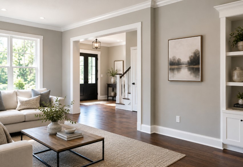
Quick example for a living room:
- 60 percent: warm white walls, oak floors, oat-colored sofa
- 30 percent: deep green armchairs and curtains
- 10 percent: brass lamps, terracotta pillows, one large painting
Lock In One Undertone
Every neutral has an undertone hiding inside it. A gray can read blue, green, or violet. A white can read pink, yellow, or gray. Mixing undertones is the most common reason a freshly painted room still looks off.
Benjamin Moore publishes a Color Trends palette each year that groups colors by shared undertone, which makes it easier to pick neutrals that agree with each other. See Benjamin Moore Color Trends for current groupings.
Decide on warm or cool first. Then choose every neutral in the house from that side of the line.
Test Paint at Home, Not in the Store
Store lighting lies. Paint a 24 by 24 inch sample on at least two walls of the room, and look at it in morning light, afternoon light, and at night under the lamps you actually use.
Tape a white index card next to each swatch so you can judge the undertone honestly. If the swatch looks dingy next to pure white, it is reading dingy in the room too.
Lighting in DMV Homes
Local conditions matter. Many Bethesda, Potomac, and Chevy Chase homes feature deep porches, mature trees, and north-facing rear additions. North light reads cool and flattens warm colors.
For rooms that face north, pick a warm white or a neutral with a yellow or peach undertone. For bright south-facing additions and sunrooms, cooler grays and greens hold up without going washed out. If you're planning a connected layout, our guide to open concept living covers how light travels between zones.
DMV brick exteriors run orange, pink, or red. If your living room has an exposed-brick wall or sits next to a brick fireplace, pull a secondary color from that brick rather than fighting it.
Use Trend Colors as Accents, Not Foundations
Pantone selects a Color of the Year each December, and the announcement shapes furniture, fabric, and decor releases for the following year. See the Pantone Color of the Year archive to track the direction of the market.
Treat that color as part of your 10 percent accent layer. Use it in pillows, throws, art, and small ceramics that you can swap. Reserve walls and large furniture for colors you will still like in five years.
Room-by-Room Guidance
Living Room
Anchor with a warm neutral and add depth with one saturated secondary color across upholstery or drapery. Rotate accent colors with the seasons.
Kitchen
Two-tone kitchens hold up well. Lighter upper cabinets keep the room bright. Darker lower cabinets or a contrasting island add weight. Repeat a stone undertone from the counters in either the backsplash or the wall paint.
Primary Bedroom
Choose low-saturation colors that calm the room: soft greens, muted blues, warm taupe, or deep navy on a single accent wall behind the bed. Avoid pure cool gray, which often reads cold under bedside lamps.
Bathrooms
Powder rooms tolerate bold color and pattern because guests pass through quickly. Primary bathrooms benefit from soft, spa-like palettes that pair well with chrome, brass, or matte black fixtures — see our modern bathroom design ideas for spa-like direction.
Home Office
Pick a color that reads well on video calls. Mid-tone greens and warm off-whites flatter most skin tones. Avoid bright white walls directly behind your desk, since they blow out the camera.
Mistakes That Sink a Palette
- • Choosing paint from a 2 by 3 inch chip under fluorescent store light
- • Ignoring the undertone of the floor before picking a wall color
- • Mixing warm whites on trim with cool whites on the ceiling
- • Using more than three colors in the 60-30-10 split
- • Picking a trend color for kitchen cabinets you cannot easily repaint
- • Forgetting that wood tones count as colors in the palette
A Simple Process That Works
- List every fixed surface in the room and its undertone.
- Pick warm or cool for the whole house.
- Choose three colors: dominant, secondary, accent.
- Paint sample boards and view them across a full day.
- Commit to the dominant color first, then layer in furniture, then add accents last.
When to Hire a Designer
Color decisions get harder when a project spans several rooms, mixes new finishes with existing furniture, or covers a whole-home renovation. A designer saves time by narrowing the choices and saves money by preventing the wrong gallon of paint and the wrong sofa fabric.
At iDesign Interior Solutions, our designers build palettes around the surfaces you already own and the light your house already has. We work across Bethesda, North Bethesda, Rockville, Potomac, Chevy Chase, and the wider DMV.
Ready to lock in a palette that fits your home?
Book a free design consultation and we will review your fixed surfaces, your light, and your existing furniture before recommending colors.
Request your free consultation